I like to design logos on the side as freelance in order to keep on improving my graphic design skills. I have a questionnaire that I use as a guide for the first contact with the client. Over the years I have learned that this helps to organize the client´s ideas and bring structure to the project. In this process I research the client´s intentions with there logo, I investigate who their main competition is, what colors best help communicate their message and where they will be mostly using the logo. For example: you can´t use the same design techniques for a logo that will be used for an app / icon, then one that will be used for back lit lettering for a restaurant. I usually give the client 3 options for them to choose from and then a 2-3 iterations to get to the final design.


A couple of years ago when peer-to-peer ridesharing was just starting in Mexico it was a good idea to buy several cars and have people drive them for you. Draiber was a company that solved this issue. They would hire qualified drivers for you to fill your fleet of cars. The client asked for their logo to be very similar to the UBER logo so people would make a direct connection. And as part of their policy was that all their drivers had to look professional, they always had to wear a tie. This is why the tie with three stripes is incorporated into the logo and the same three stripes are on the capital letter D in the icon.

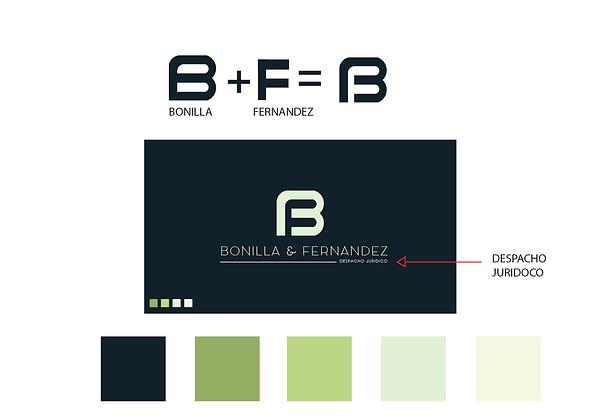
I was given the task to design a logo which represented both partners in a new law firm. They were very adamant that I incorporated both their lasts names. Taking the first letter of both their lasts names, Bonilla & Fernandez I incorporated the “F” into the “B” and used it as the focal point of the design. Below the icon I wrote that they were a law firm so there would be no mistaking what their company did.


I was given the task to design a logo which represented both partners in a new law firm. They were very adamant that I incorporated both their lasts names. Taking the first letter of both their lasts names, Bonilla & Fernandez I incorporated the “F” into the “B” and used it as the focal point of the design. Below the icon I wrote that they were a law firm so there would be no mistaking what their company did.